An essential part of the data scientist’s job is to be able to synthesize information into powerful graphical representations. This chapter looks at the challenges of data representation with Python, the ecosystem for doing this. It also opens the door to interactive data representation with Plotly or Altair.
Visualisation
Exercice
Author
Lino Galiana
Published
2026-07-25
If you want to try the examples in this tutorial:
TipWhat you will learn in this chapter
Get to know the matplotlib and seaborn ecosystems, and learn how to build charts by progressively layering elements.
Explore the modern plotnine library — a Python implementation of R’s ggplot2 — which provides a powerful grammar of graphics for constructing visualizations.
Understand how to create interactive, web-based visualizations using the plotly and altair packages.
Learn about the key principles of effective data visualization, including the trade-offs involved in delivering a clear message and the limitations of some traditional chart types.
This chapter focuses on data visualization and presents a classic task for data scientists and data engineers: constructing figures that populate an analytical dashboard, providing a retrospective view of a phenomenon of interest.
To illustrate this, we are going to reproduce several charts available on the City of Paris’ open data portal . Since these charts do not always adhere to best practices in data visualization, we will at times modify them in order to make the represented information more accessible.
The ability to construct effective and engaging data visualizations is an essential skill for any data scientist or researcher. To improve the quality of such visualizations, it is advisable to follow the recommendations offered by specialists in dataviz and graphic semiology.
High-quality visualizations, such as those produced by the New York Times, depend not only on the use of appropriate tools (for example, JavaScript libraries), but also on adherence to established principles of representation that allow the message of a visualization to be grasped within seconds.
Because it is not easy to convey complex information to an audience in a clear and synthetic manner, it is important to consider both the reception of a visualization and the principal messages it is intended to communicate. This presentation by Eric Mauvière illustrates, through numerous examples, how visualization choices influence the effectiveness of the message delivered.
Among other resources that I have found particularly useful, this blog post by datawrapper, a reference in the field of visualization, is especially insightful. This blog post by Albert Rapp also demonstrates how to progressively construct an effective visualization and is well worth revisiting periodically. Finally, among the sites that merit frequent consultation, the resources available on Andrew Heiss’s blog are of considerable value.
Several major families of graphical representations can be distinguished: visualizations of distributions for a single variable, visualizations of relationships between multiple variables, and maps that allow one or more variables to be represented in space.
Each of these families encompasses a variety of specific figure types. For example, depending on the nature of the phenomenon, visualizations of relationships may take the form of a time series (the evolution of a variable over time), a scatter plot (the correlation between two variables), or a bar chart (illustrating the relative relationship between the values of one variable in relation to another), among others.
Rather than attempting to provide an exhaustive catalogue of possible visualizations, this chapter and the next will present a selection designed to encourage further analysis prior to the implementation of any modeling. This chapter focuses on traditional visualizations, while the following chapter is devoted to cartography. Together, these chapters aim to provide an initial framework for synthesizing the information contained in a dataset.
The subsequent step is to advance the work of communication and synthesis through outputs that may take diverse forms, such as reports, scientific publications, articles, presentations, interactive applications, websites, or notebooks such as those used in this course. The general principle remains the same regardless of the medium, and is of particular interest to data scientists when the task involves intensive use of data and requires a reproducible output. A chapter dedicated to this topic may be added to the course in the future1.
ImportantUse an interactive interface to visualize graphics
For visualization chapters, it is highly recommended to use Python via an interactive interface such as a notebook Jupyter (via VSCode or Jupyter for example, see the notebook presentation chapter ).
This makes it possible to view the graphics immediately below each code cell, to adjust them easily, and to test modifications in real time.
Conversely, if scripts are run from a conventional console (e.g., by writing to a .py file and executing line by line with MAJ+,ENTREE in VSCode), the graphics will not be displayed in a popup window_ requiring additional commands to save them, before opening the exports manually and being able to correct the code if necessary. This makes for a more laborious learning experience.
Data
This chapter is based on the bicycle passage count data from Parisian measurement points, published on the open data website of the City of Paris.
The analysis of recent historical data has been made easier by the availability of datasets in the Parquet format, a modern alternative that is more efficient and convenient than CSV. Further information on this format can be found in the resources cited in the paragraph dedicated to it in the final chapter of the section on data manipulation .
Code pour importer les données à partir du format Parquet
import osimport requestsfrom tqdm import tqdmimport pandas as pdimport duckdburl ="https://minio.lab.sspcloud.fr/lgaliana/data/python-ENSAE/comptage-velo-donnees-compteurs.parquet"# problem with https://opendata.paris.fr/api/explore/v2.1/catalog/datasets/comptage-velo-donnees-compteurs/exports/parquet?lang=fr&timezone=Europe%2FParisfilename ='comptage_velo_donnees_compteurs.parquet'# DOWNLOAD FILE --------------------------------# Perform the HTTP request and stream the downloadresponse = requests.get(url, stream=True)ifnot os.path.exists(filename):# Perform the HTTP request and stream the download response = requests.get(url, stream=True)# Check if the request was successfulif response.status_code ==200:# Get the total size of the file from the headers total_size =int(response.headers.get('content-length', 0))# Open the file in write-binary mode and use tqdm to show progresswithopen(filename, 'wb') asfile, tqdm( desc=filename, total=total_size, unit='B', unit_scale=True, unit_divisor=1024, ) as bar:# Write the file in chunksfor chunk in response.iter_content(chunk_size=1024):if chunk: # filter out keep-alive chunksfile.write(chunk) bar.update(len(chunk))else:print(f"Failed to download the file. Status code: {response.status_code}")else:print(f"The file '{filename}' already exists.")# READ FILE AND CONVERT TO PANDAS --------------------------query ="""SELECT id_compteur, nom_compteur, id, sum_counts, dateFROM read_parquet('comptage_velo_donnees_compteurs.parquet')"""# READ WITH DUCKDB AND CONVERT TO PANDASdf = duckdb.sql(query).df()
id_compteur
nom_compteur
id
sum_counts
date
0
100003098-101003098
106 avenue Denfert Rochereau NE-SO
100003098
36
2024-01-01 03:00:00+00:00
1
100003098-101003098
106 avenue Denfert Rochereau NE-SO
100003098
27
2024-01-01 04:00:00+00:00
2
100003098-101003098
106 avenue Denfert Rochereau NE-SO
100003098
10
2024-01-01 06:00:00+00:00
To import the graphical libraries we will use in this chapter, execute
import matplotlib.pyplot as pltimport seaborn as snsfrom plotnine import*
WarningWarning
Importing libraries in the form from package import * is not a very good practice.
However, for a package like plotnine, many of whose functions we’ll be using, it would be a bit tedious to import functions on a case-by-case basis. What’s more, it allows us to reuse the ggplotR library code examples, which are plentiful on the Internet with visual demonstrations, almost as they are. from package import * is the Python equivalent of the library(package) practice in R.
Since we will regularly recreate variations of the same figure, we will create variables for the axis labels and the title:
title="The 10 bikemeters with the highest hourly average"xaxis="Meter name"yaxis="Hourly average"
1 A first figure with Pandas’ Matplotlib API
Trying to produce a perfect visualization on the first attempt is unrealistic. It is much more practical to gradually improve a graphical representation to progressively highlight structural effects in a dataset.
We will begin by visualizing the distribution of bicycle counts at the main measurement stations. To do this, we will quickly create a barplot and then improve it step by step.
In this section, we will reproduce the first two charts from the data analysis page : The 10 counters with the highest hourly average and The 10 counters that recorded the most bicycles. The numerical values of the charts may differ from those on the webpage, which is expected, as we are not necessarily working with data as up-to-date as that online.
1.1 Understanding the Basics of matplotlib
matplotlib dates back to the early 2000s and emerged as a Python alternative for creating charts, similar to Matlab, a proprietary numerical computation software. Thus, matplotlib is quite an old library, predating the rise of Python in the data processing ecosystem. This is reflected in its design, which may not always feel intuitive to those familiar with the modern data science ecosystem. Fortunately, many libraries build upon matplotlib to provide syntax more familiar to data scientists.
matplotlib primarily offers two levels of abstraction: the figure and the axes. The figure is essentially the “canvas” that contains one or more axes, where the charts are placed. Depending on the situation, you might need to modify figure or axis parameters, which makes chart creation highly flexible but also potentially confusing, as it’s not always clear which abstraction level to modify2. As shown in Figure 1.1, every element of a figure is customizable.
Figure 1.1: Understanding the Anatomy of a matplotlib Figure (Source: Official Documentation)
In practice, there are two ways to create and update your figure, depending on your preference:
The explicit approach, inheriting an object-oriented programming logic, where Figure and Axes objects are created and updated directly.
The implicit approach, based on the pyplot interface, which uses a series of functions to update implicitly created objects.
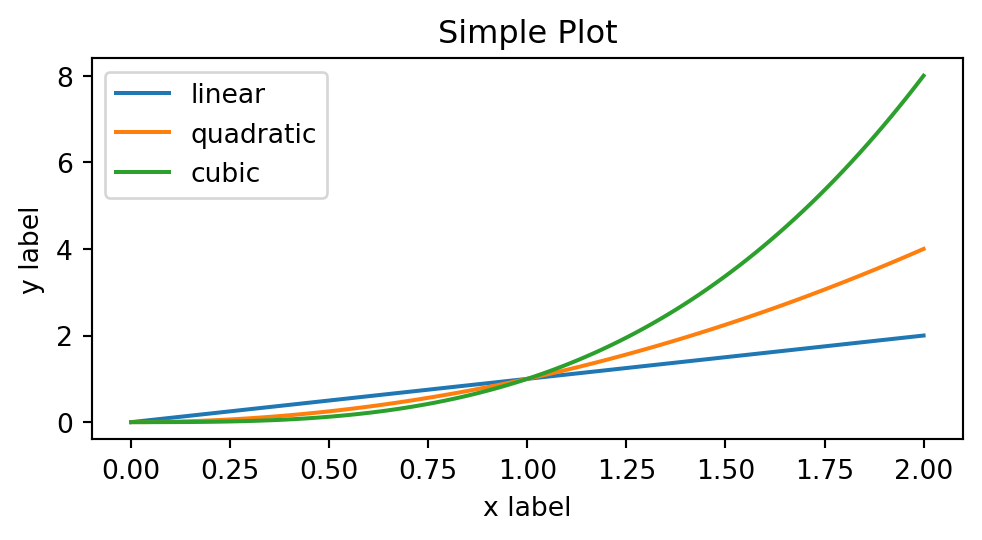
import numpy as npimport matplotlib.pyplot as pltx = np.linspace(0, 2, 100) # Sample data.# Note that even in the OO-style, we use `.pyplot.figure` to create the Figure.fig, ax = plt.subplots(figsize=(5, 2.7), layout='constrained')ax.plot(x, x, label='linear') # Plot some data on the Axes.ax.plot(x, x**2, label='quadratic') # Plot more data on the Axes...ax.plot(x, x**3, label='cubic') # ... and some more.ax.set_xlabel('x label') # Add an x-label to the Axes.ax.set_ylabel('y label') # Add a y-label to the Axes.ax.set_title("Simple Plot") # Add a title to the Axes.ax.legend() # Add a legend.
These elements are the minimum required to understand the logic of matplotlib. To become more comfortable with these concepts, repeated practice is essential.
1.2 Discovering matplotlib through Pandas
It’s often handy to produce a graph quickly, without necessarily worrying too much about style, but to get a quick idea of the statistical distribution of your data. For this, the integration of basic graphical functions in Pandas is handy: you can directly apply a few instructions to a DataFrame and it will produce a matplotlib figure.
The aim of Exercise 1 is to discover these instructions and how the result can quickly be reworked for visual descriptive statistics.
TipExercise 1: Create an initial plot
The data includes several dimensions that can be analyzed statistically. We’ll start by focusing on the volume of passage at various counting stations.
Since our goal is to summarize the information in our dataset, we first need to perform some ad hoc aggregations to create a readable plot.
Retain the ten stations with the highest average. To get an ordered plot from largest to smallest using Pandas plot methods, the data must be sorted from smallest to largest (yes, it’s odd but that’s how it works…). Sort the data accordingly.
Initially, without worrying about styling or aesthetics, create the structure of a barplot (bar chart) as seen on the
data analysis page.
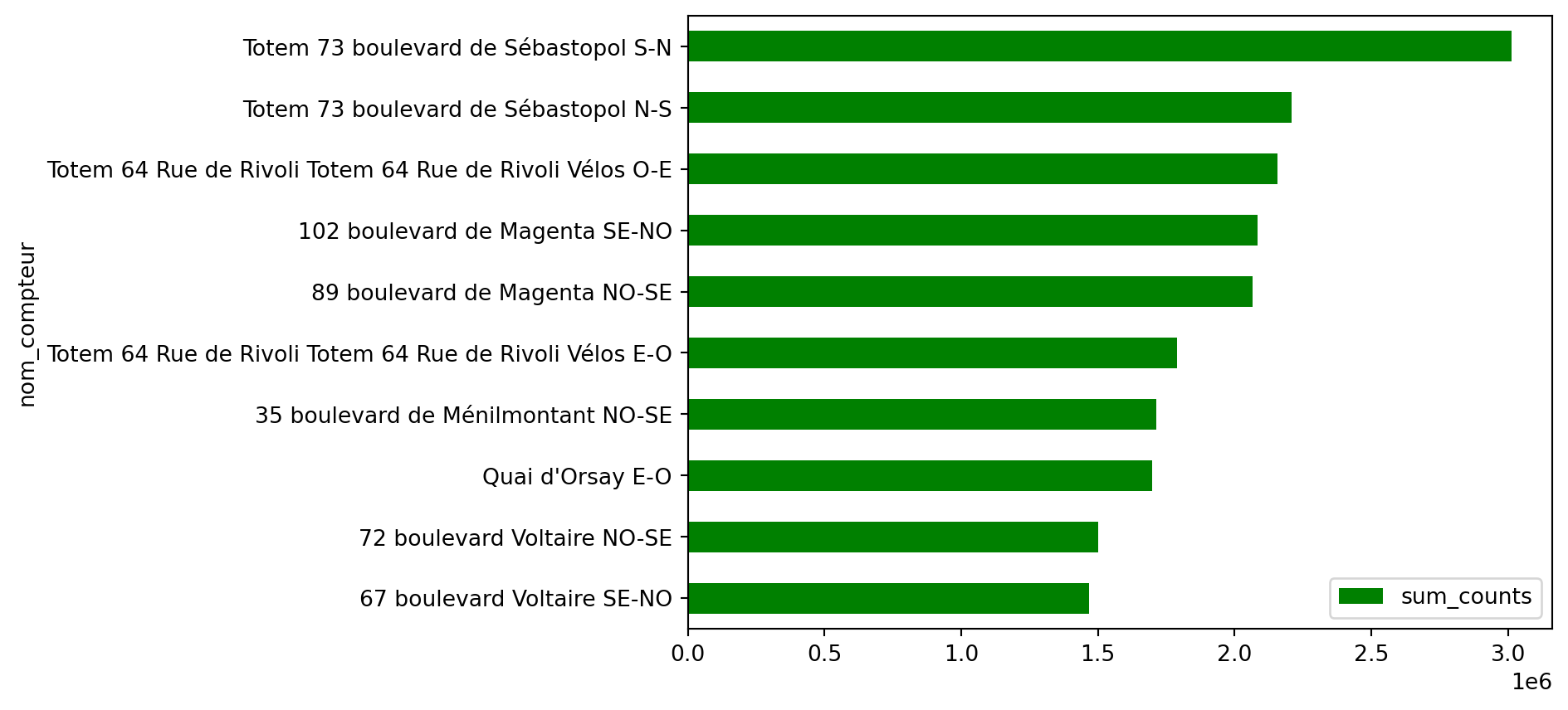
To prepare for the second figure, retain only the 10 stations that recorded the highest total number of bicycles.
As in question 2, create a barplot to replicate figure 2 from the Paris open data portal.
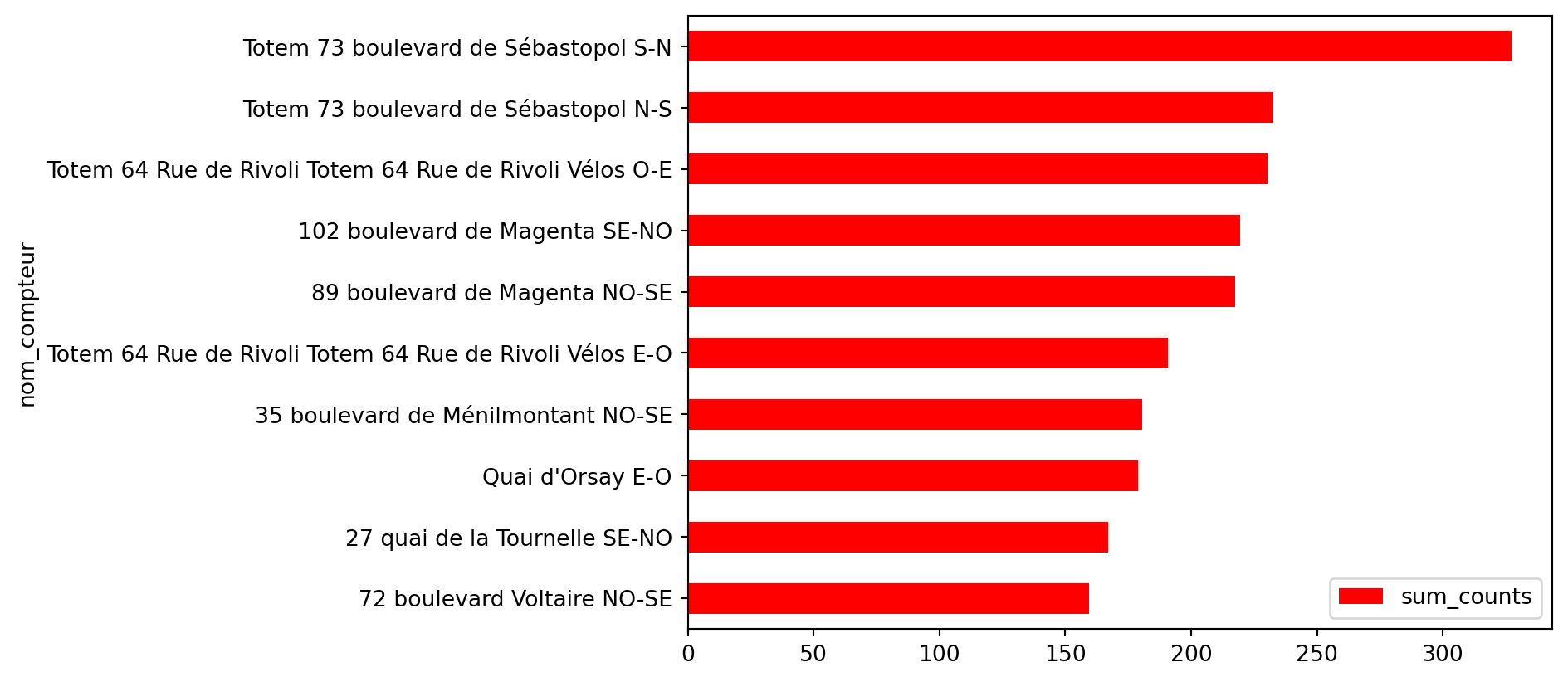
The top 10 stations from question 1 are those with the highest average bicycle traffic. These reordered data allow for creating a clear visualization highlighting the busiest stations.
sum_counts
nom_compteur
72 boulevard Voltaire NO-SE
159.539148
27 quai de la Tournelle SE-NO
166.927660
Quai d'Orsay E-O
178.842743
35 boulevard de Ménilmontant NO-SE
180.364565
Totem 64 Rue de Rivoli Totem 64 Rue de Rivoli Vélos E-O
190.852164
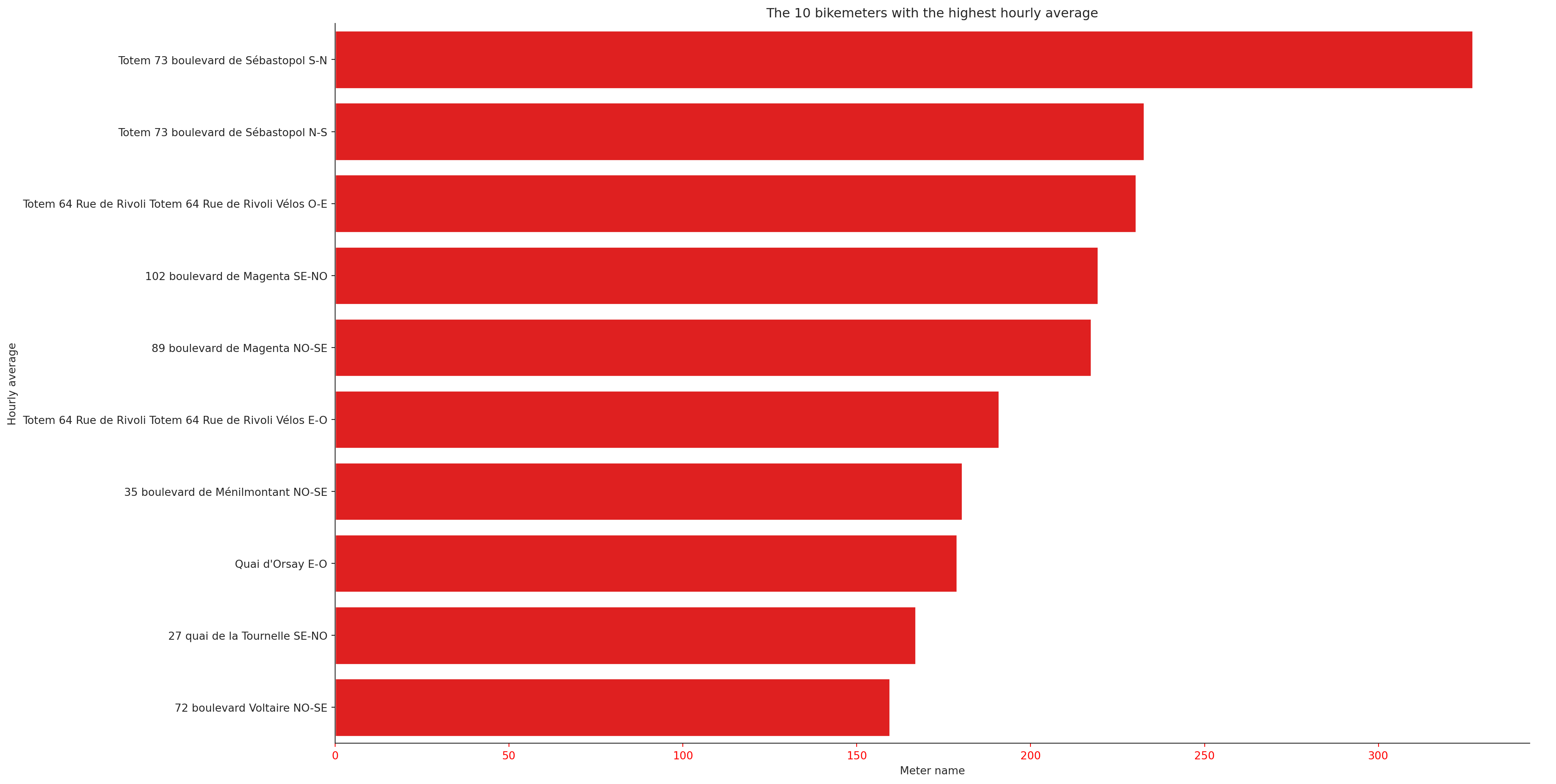
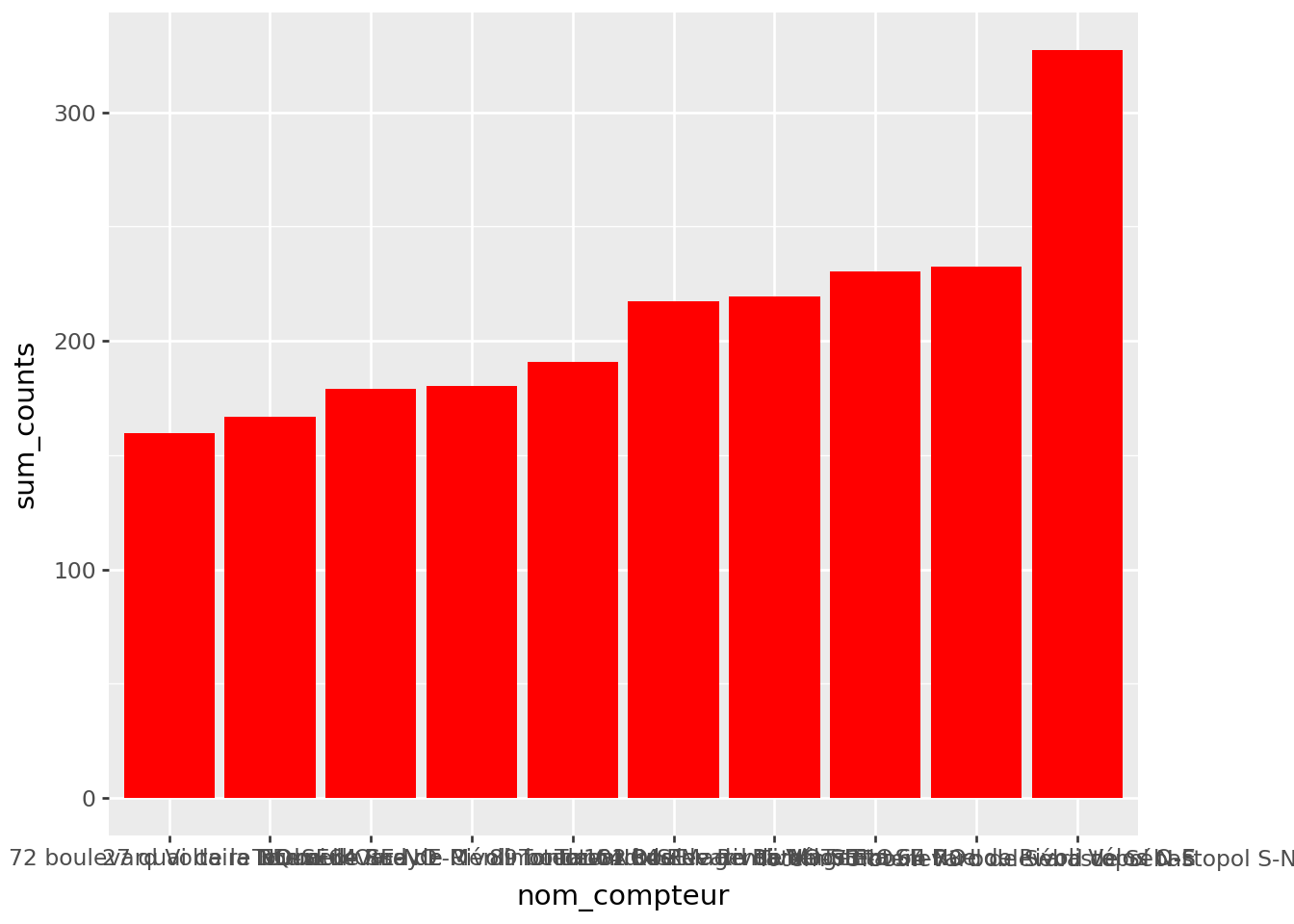
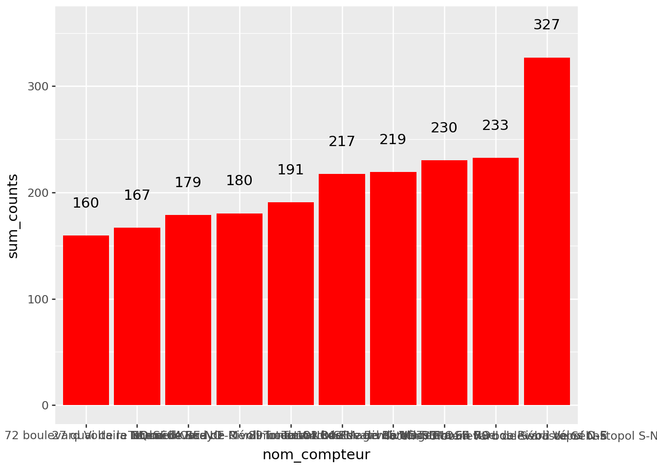
Figure 1.2, displays the data in a basic barplot. While it conveys the essential information, it lacks aesthetic layout, harmonious colors, and clear annotations, which are necessary to improve readability and visual impact.
Figure 1 (click here to mask)
Figure 1.2: First draft for ‘The 10 meters with the highest hourly average’
Figure 2 without styling (click here to mask):
Figure 1.3: First draft of the figure ‘The 10 counters that recorded the most bicycles’
Our visualization starts to communicate a concise message about the nature of the data. In this case, the intended message is the relative hierarchy of station usage.
Nevertheless, several issues remain. Some elements are problematic (for example, labels), others are inconsistent (such as axis titles), and still others are missing altogether (including the title of the graph). This figure remains somewhat unfinished.
Since the graphs produced by Pandas are based on the highly flexible logic of matplotlib, they can be customized extensively. However, this often requires considerable effort, as the matplotlib grammar is neither as standardized nor as intuitive as that of ggplot in R. For those wishing to remain within the matplotlib ecosystem, it is generally preferable to use seaborn directly, as it provides several ready-to-use options. Alternatively, one can turn, as we shall do here, to the plotnine ecosystem, which offers the standardized ggplot syntax for modifying the various elements of a figure.
2 Using seaborn directly
2.1 Understanding seaborn in a Few Lines
seaborn is a high-level interface built on top of matplotlib. This package provides a set of features to create matplotlib figures or axes directly from a function with numerous arguments. If further customization is needed, matplotlib functionalities can be used to update the figure, whether through the implicit or explicit approaches described earlier.
As with matplotlib, the same figure can be created in multiple ways in seaborn. seaborn inherits the figure-axes duality from matplotlib, requiring frequent adjustments at either level. The main characteristic of seaborn is its standardized entry points, such as seaborn.relplot or seaborn.catplot, and its input logic based on DataFrame, whereas matplotlib is structured around Numpy arrays. However, it is important to be aware that seaborn suffers from the same limitations as matplotlib, particularly the unintuitive nature of the customisation elements, which, if not found in the arguments, can be a headache to implement.
The figure now conveys a message, but it is still not very readable. There are several ways to create a barplot in seaborn. The two main ones are:
sns.catplot
sns.barplot
For this exercise, we suggest using sns.catplot. It is a common entry point for plotting graphs of a discretized variable.
2.2 Reproduction of the previous example with seaborn
We will simply reproduce Figure 1.2 with seaborn. To do this, here is the code needed to have a ready-to-use DataFrame:
TipExercise 2: reproduce the first figure with seaborn
Redraw the previous graph using the catplot function from seaborn. To control the size of the graph, you can use the height and aspect arguments.
Add axis titles and a title to the graph.
Even if it does not add any information, try colouring the x axis red, as in the figure on the open data portal. You can predefine a
style with sns.set_style('ticks', {'xtick.color': 'red'}).
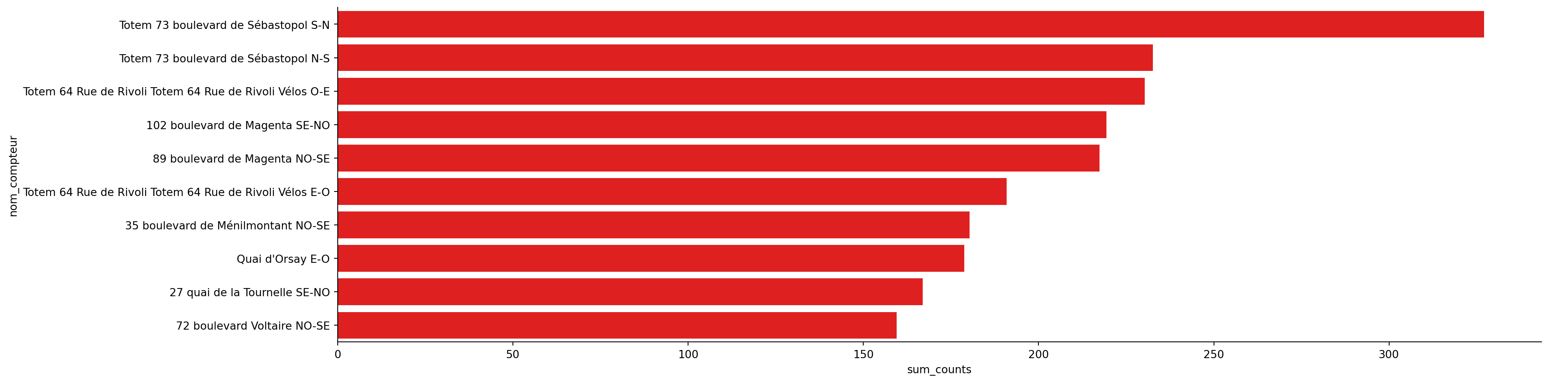
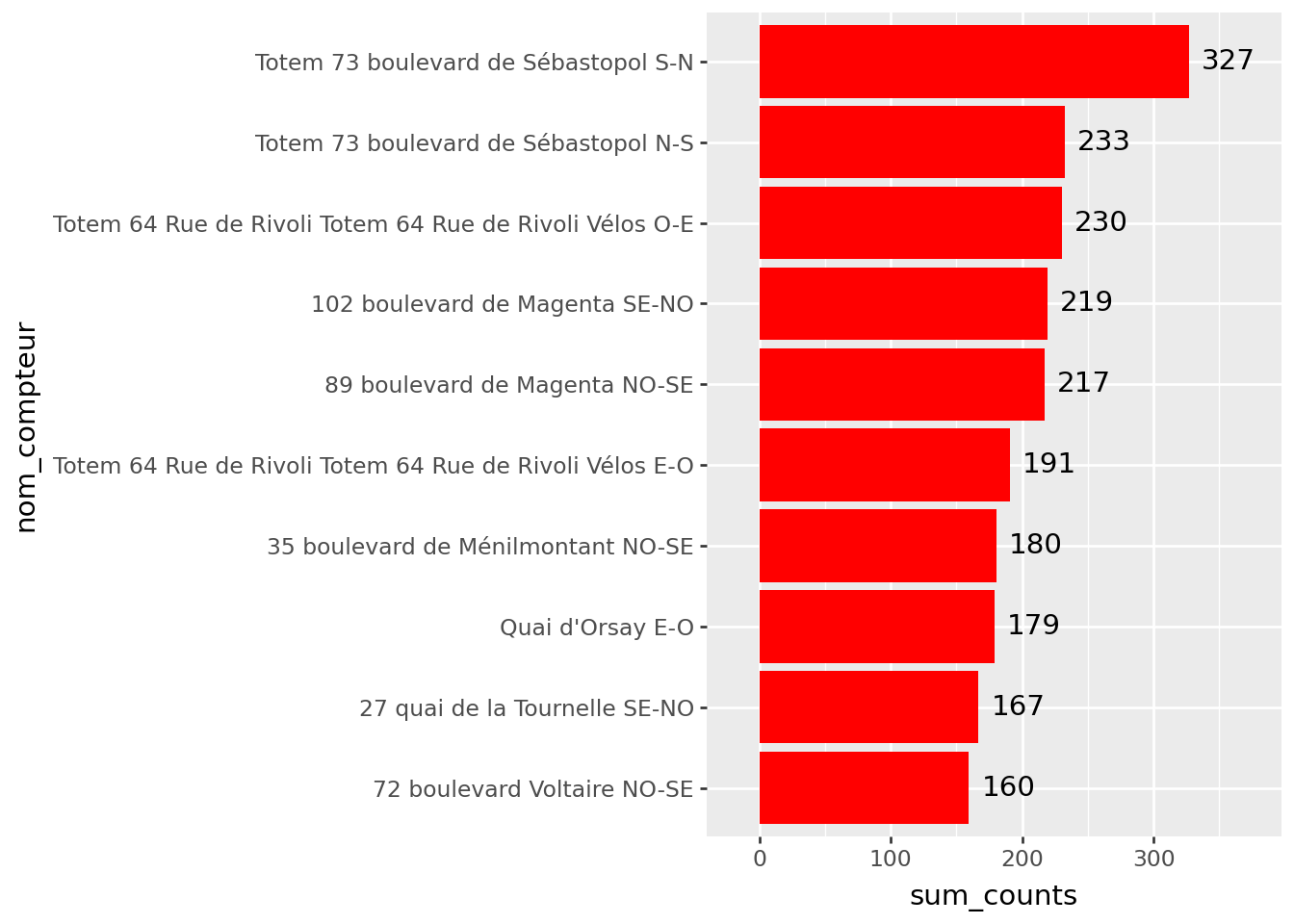
At the end of question 1, i.e. using seaborn to reproduce a minimal barplot, we obtain Figure 2.1. This is already a little cleaner than the previous version (Figure 1.2) and may already be sufficient for exploratory work.
Figure 2.1
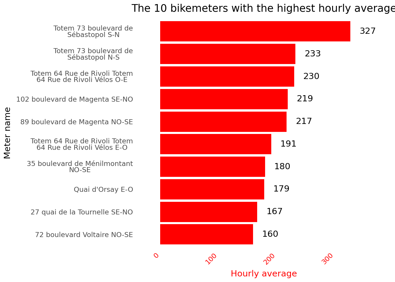
At the end of the exercise, we obtain a figure close to the one we are trying to reproduce. The main difference is that ours does not include numerical values.
Figure 2.2
This shows that Boulevard de Sébastopol is the most traveled, which won’t surprise you if you cycle in Paris. However, if you’re not familiar with Parisian geography, this will provide little information for you. You’ll need an additional graphical representation: a map! We will cover this in a future chapter.
3 And here enters Plotnine, a pythonic grammar of graphics
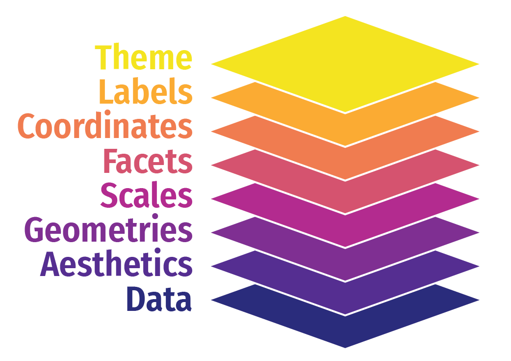
plotnine is the newcomer to the Python visualization ecosystem. This library is developed by Posit, the company behind the RStudio editor and the tidyverse ecosystem, which is central to the R language. This library aims to bring the logic of ggplot to Python, meaning a standardized, readable, and flexible grammar of graphics inspired by Wilkinson (2011).
In this approach, a chart is viewed as a succession of layers that, when combined, create the final figure. This principle is not inherently different from that of matplotlib. However, the grammar used by plotnine is far more intuitive and standardized, offering much more autonomy for modifying a chart.
With plotnine, there is no longer a dual figure-axis entry point. As illustrated in the slides below:
A figure is initialized
Layers are updated, a very general abstraction level that applies to the data represented, axis scales, colors, etc.
Finally, aesthetics can be adjusted by modifying axis labels, legend labels, titles, etc.
We will need hierarchical data to have bars ordered in a consistent manner:
TipExercise 4: Reproduce the First Figure with plotnine
This is the same exercise as Exercise 2. The objective is to create this figure with plotnine.
For this exercise, we offer a step-by-step guided correction to illustrate the logic behind the grammar of graphs.
3.1 The plot grid: ggplot()
The first step in any figure is to define the object of the graph, i.e. the data that will be visually represented. This is done using the ggplot statement with the following parameters:
The DataFrame, the first parameter of any call to ggplot.
The main variable aesthetic parameters - which are inserted into aes (aesthetics) - which will be common to the different layers. In this case, we only have the axes to declare, but depending on the nature of the graph, we could have other aesthetics whose behaviour would be controlled by a variable in our dataset: colour, point size, curve width, transparency, etc.
This gives us the structure of the graph into which all subsequent elements will be inserted. Regarding the chosen \(x\) and \(y\), this declaration will define a vertical bar plot. We will then see that we are going to reverse the axes to make it more readable, but that will come later.
3.2 Add geometries: geom_*
Graphical layers are defined by the geom_ family of functions according to an additive logic (hence the +). These are controlled on two levels:
In the parameters defined by aes, either at the global level (ggplot) or at the level specific to the geometry in question (in the call to geom_)
In the constant parameters that apply uniformly to the layer, defined as constant parameters
You can add several successive layers. For example, the numerical values displayed to provide context can be created using geom_text, whose positioning on the figure is managed by the same parameters as the other layers:
This position parameter is unnecessary, even annoying, right now. But we will use it later to shift the label (see plotnine documentation ) when we have reversed the axes.
Figure 3.3: La seconde couche de géométrie (texte)
The harmonisation of visual element declarations enabled by the graphics grammar is achieved using geom_* geometries. It is therefore logical that their behaviour should also be controlled in a standardised manner, using another family of functions: scale_ (scale_x_discrete, scale_x_continuous, scale_color_discrete, etc.).
Thus, each aesthetic (x, y, colour, fill, size, etc.) can be finely tuned in a systematic way via its own scale (scale_*). This offers almost total control over the visual translation of the data.
The functions of the coord_* family, which modify the coordinate system, can also be included in this category. In this case, we will use coord_flip to obtain a vertical bar chart.
Here, there are few parameters to modify since our scales already suit us well (we don’t have to use log to compress the scale, apply a colour palette, etc.). We’ll just enlarge the \(x\) axis a little so we can enter our numerical values. As before, when swapping coordinates with coord_flip, the axis in question is \(y\), so we’ll play around with scale_y_continuous.
3.3 Labels and themes
The final declaration of our figure is done using the formal elements that are labels (axes, titles, reading notes, etc.) and the theme (preconfigured through the theme_ family or customised with the parameters of the theme function). Before that, let’s reduce the size of our labels by \(y\)
The Parisian bikemeters with the highest volume of cyclists.
Figure 3.6
Although brief, this introduction to the world of ggplot graphics grammar shows just how intuitive - once you understand its logic - and powerful it is.
CautionCaution
To effectively contextualize time-based data, it’s standard practice to use dates along the x-axis. To maintain readability, avoid overloading the axis with too much detail such as showing every single day when months would suffice.
Rotating text vertically to squeeze more labels onto the axis isn’t a great solution - it mostly just gives your reader a sore neck. It’s often better to reduce the number of labels and, if needed, add annotations for particularly important dates.
4 Visualisations alternatives
So far, we have conscientiously reproduced the visualisations offered on the Paris open data dashboard. But we may want to convey the same information using different visualisations:
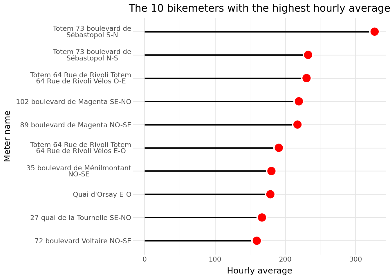
Lollipop charts are very similar to bar charts, but the visual information is a little more efficient: instead of a thick bar to represent the values, there is a thinner line, which can help to really perceive the scales of magnitude in the data.
Since we need to contextualise the figure with the exact values – while waiting to discover the world of interactivity – why not use a table and insert graphs into it? Tables are not a bad communication medium; on the contrary, if they offer hierarchical visual information, they can be very useful!
Bar charts (barplot) are extremely common, likely due to the legacy of Excel, where these charts can be created with just a couple of clicks. However, in terms of conveying a message, they are far from perfect. For example, the bars take up a lot of visual space, which can obscure the intended message about relationships between observations.
From a semiological perspective, that is, in terms of the effectiveness of conveying a message, lollipop charts are preferable: they convey the same information but with fewer visual elements that might clutter understanding.
Lollipop charts are not perfect either but are slightly more effective at conveying the message. To learn more about alternatives to bar charts, Eric Mauvière’s talk for the public statistics data scientists network, whose main message is “Unstack your figures”, is worth exploring (available on ssphub.netlify.app/ ).
With plotnine, it is not too complicated to create a lollipop chart. All you need are two geometries:
The stick of the lollipop is created with a geom_segment;
The tip of the lollipop is created with a geom_point.
This alternative representation provides a clearer picture of the difference between the most frequently used counter and the others.
The lollipop chart is a fairly standard representation in biostatistics and economics for representing odds ratios derived from logistic modelling. In this case, the lines are generally used to represent the size of the confidence interval in this literature.
A variant of the lollipop chart, popularised in particular by datawrapper , also allows intervals to be represented: the range plot. It allows both the hierarchy between observations and the amplitude of a phenomenon to be represented.
![Example of a range plot by Eric Mauvière (ssphub.netlify.app/ ).] (https://ssphub.netlify.app/talk/2024-02-29-mauviere/mauviere.png)
4.1 A stylised table
Tables are a good medium for communicating precise values. But without the addition of contextual elements, such as colour intensities or figures, they are of little help in visually perceiving discrepancies or orders of magnitude.
Thanks to the richness of the HTML format, which allows lightweight graphics to be inserted directly into cells, it is possible to combine numerical precision with visual readability. This gives us the best of both worlds.
We have previously used the great_tables package to represent aggregated statistics. Here, we will use it to integrate a lollipop chart into a table, allowing immediate reading of values while maintaining their accuracy.
We will take this opportunity to clean up the text to be displayed by removing duplicate labels and isolating the direction.
We will also create an intermediate column to create a colourful summary visualisation allowing us to see the counters on several lines.
Code
import matplotlib.pyplot as pltdf1["nom_compteur_temp"] = df1["nom_compteur"]# Discrete colormapcategories = df1["nom_compteur_temp"].unique()cmap = plt.get_cmap("Dark2")# Create mapping from label to color hexcolors = {cat: cmap(i /max(len(categories) -1, 1)) for i, cat inenumerate(categories)}colors = {k: plt.matplotlib.colors.to_hex(v) for k, v in colors.items()}# Function to return colored celldef create_color_cell(label: str) ->str: color = colors.get(label, "#ccc")returnf""" <div style=" width: 20px; height: 20px; background-color: {color}; border-radius: 3px; margin: auto; "></div> """
We will create a dictionary to rename our columns in a more intelligible form than the variable names, as well as a variable for referencing the source.
columns_mapping = {"nom_compteur": "Location","direction": "","text": "","sum_counts": "","nom_compteur_temp": ""}source_note ="**Source**: Vélib counters on the [Paris open data page](https://opendata.paris.fr/explore/dataset/comptage-velo-donnees-compteurs/dataviz/?disjunctive.id_compteur&disjunctive.nom_compteur&disjunctive.id&disjunctive.name)"
A tooltip is a text that appears when hovering over an element in a chart on a computer, or when tapping on it on a smartphone. It adds an extra layer of information through interactivity and can be a useful way to declutter the main message of a visualization.
That said, like any element of a chart, a tooltip requires thoughtful design to be effective. The default tooltips provided by visualization libraries are rarely sufficient. You need to consider what message the tooltip should convey as a textual complement to the visual data shown in the chart.
Again, we won’t go into detail here - this topic alone could fill an entire data visualization course - but it is important to keep in mind when designing interactive charts.
Another important topic we won’t cover here is responsiveness: the ability of a visualization (or a website more generally) to display clearly and function properly across different screen sizes. Designing for multiple devices is challenging but essential, especially given that a growing share of web traffic now comes from smartphones.
In addition, accessibility is another crucial consideration in interactive visualizations. For instance, around 8% of men have some form of color vision deficiency, most commonly difficulty perceiving green (about 6%) or red (about 2%).
In short, ye who enter to data visualization, abandon all hope. While the tools themselves may be easy to use, the needs they must meet are often complex.
5.1 Ecosystem available from Python
Static figures created with matplotlib or plotnine are fixed and thus have the disadvantage of not allowing interaction with the viewer. All the information must be contained in the figure, which can make it difficult to read. If the figure is well-made with multiple levels of information, it can still work well.
However, thanks to web technologies, it is simpler to offer visualizations with multiple levels. A first level of information, the quick glance, may be enough to grasp the main messages of the visualization. Then, a more deliberate behavior of seeking secondary information can provide further insights. Reactive visualizations, now the standard in the dataviz world, allow for this approach: the viewer can hover over the visualization to find additional information (e.g., exact values) or click to display complementary details.
These visualizations rely on the same triptych as the entire web ecosystem: HTML, CSS, and JavaScript. Python users will not directly manipulate these languages, which require a certain level of expertise. Instead, they use libraries that automatically generate all the necessary HTML, CSS, and JavaScript code to create the figure.
Several Javascript ecosystems are made available to developers through Python. The two main libraries are Plotly, associated with the Javascript ecosystem of the same name, and Altair, associated with the Vega and Altair ecosystems in Javascript3. To allow Python users to explore the emerging Javascript library Observable Plot, French research engineer Julien Barnier developed pyobsplot, a Python library enabling the use of this ecosystem from Python.
Interactivity should not just be a gimmick that adds no readability or even worsens it. It is rare to rely solely on the figure as produced without further work to make it effective.
5.2 The Plotly library
The Plotly package is a wrapper for the Javascript library Plotly.js, allowing for the creation and manipulation of graphical objects very flexibly to produce interactive objects without the need for Javascript.
The recommended entry point is the plotly.express module (documentation here), which provides an intuitive approach for creating charts that can be modified post hoc if needed (e.g., to customize axes).
NoteDisplaying Figures Created with Plotly
In a standard Jupyter notebook, the following lines of code allow the output of a Plotly command to be displayed under a code block:
For JupyterLab, the jupyterlab-plotly extension is required:
!jupyter labextension install jupyterlab-plotly
5.3 Replicating the Previous Example with Plotly
The following modules will be required to create charts with plotly:
import plotlyimport plotly.express as px
TipExercise 7: A Barplot with Plotly
The goal is to recreate the first red bar chart using Plotly.
Create the chart using the appropriate function from plotly.express and…
Do not use the default theme but one with a white background to achieve a result similar to that on the open-data site.
Use the color_discrete_sequence argument for the red color.
Remember to label the axes.
Modify the hover text.
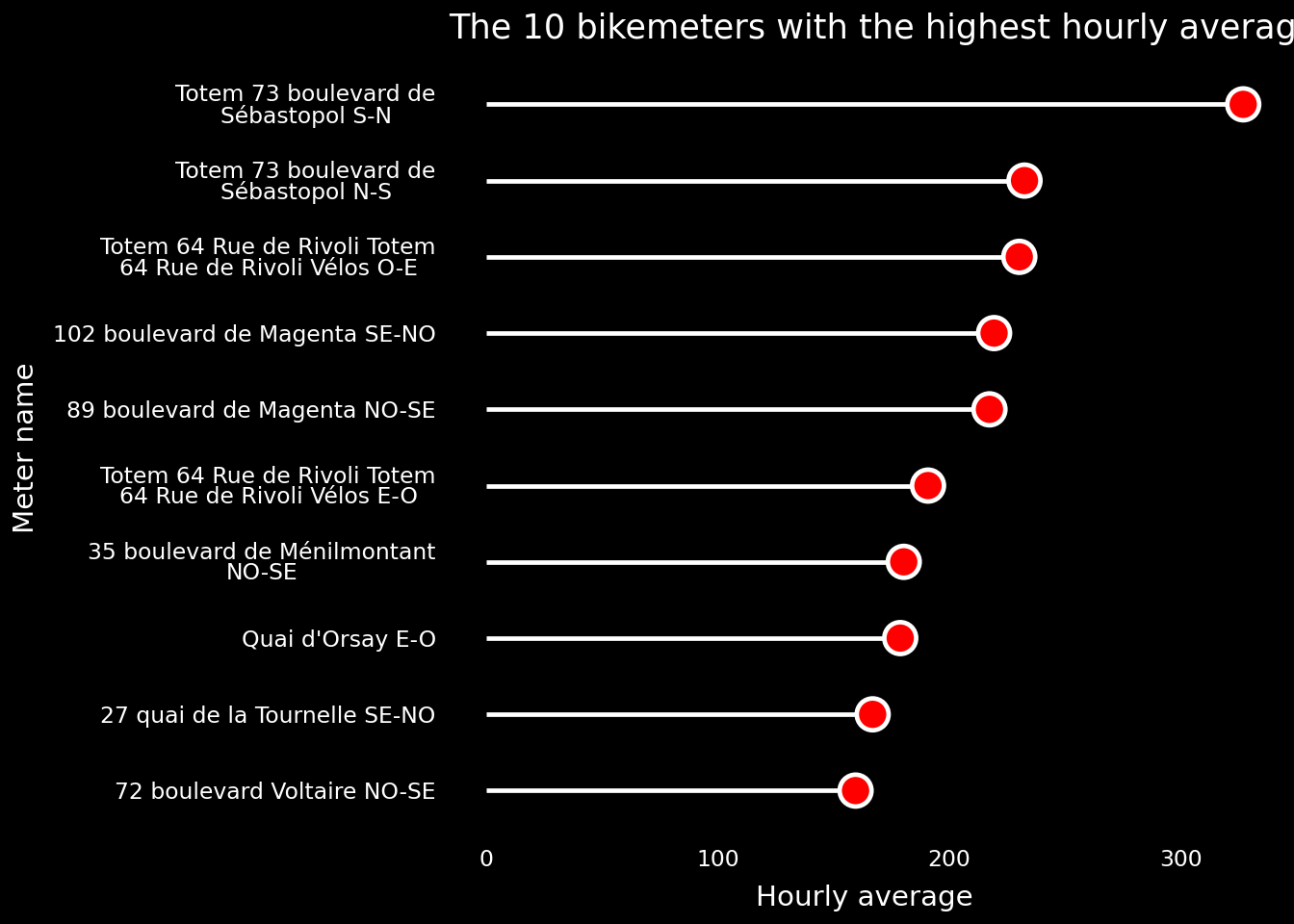
Choose a white or a dark theme and use appropriate options.
(a)
(b)
Figure 5.1
5.4 The altair library
For this example, we will recreate our previous figure.
Like ggplot/plotnine, Vega is a graphics ecosystem designed to implement the grammar of graphics from Wilkinson (2011). The syntax of Vega is therefore based on a declarative principle: a construction is declared through layers and progressive data transformations.
Originally, Vega was based on a JSON syntax, hence its strong connection to Javascript. However, there is a Python API that allows for creating these types of interactive figures natively in Python. To understand the logic of constructing an altair code, here is how to replicate the previous figure:
Galiana, Lino, Olivier Meslin, Noémie Courtejoie, and Simon Delage. 2022. “Caractéristiques Socio-économiques Des Individus Aux Formes sévères de Covid-19 Au Fil Des Vagues épidémiques.”
Wilkinson, Leland. 2011. “The Grammar of Graphics.” In Handbook of Computational Statistics: Concepts and Methods, 375–414. Springer.
Informations additionnelles
NotePython environment
This site was built automatically through a Github action using the Quarto reproducible publishing software (version 1.8.26).
The environment used to obtain the results is reproducible via uv. The pyproject.toml file used to build this environment is available on the linogaliana/python-datascientist repository
pyproject.toml
[project]name ="python-datascientist"version ="0.1.0"description ="Source code for Lino Galiana's Python for data science course"readme ="README.md"requires-python =">=3.13,<3.14"dependencies = ["altair>=6.0.0","cartiflette","contextily==1.6.2","duckdb>=0.10.1","folium>=0.19.6","gdal==3.11.4","graphviz==0.20.3","great-tables>=0.12.0","gt-extras>=0.0.8","ipykernel>=6.29.5","jupyter>=1.1.1","jupyter-cache>=1.0.0","kaleido>=0.2.1","langchain-community>=0.3.27","loguru==0.7.3","markdown>=3.8","nbclient>=0.10.0","nbformat>=5.10.4","nltk>=3.9.1","pandas>=3.0","pip>=25.1.1","plotly>=6.1.2","plotnine>=0.15","polars>=1.8.2","pyarrow>=17.0.0","pynsee>=0.1.8","python-dotenv>=1.0.1","python-frontmatter>=1.1.0","pywaffle>=1.1.1","requests>=2.32.3","scikit-image>=0.24.0","scikit-learn>=1.8.0","scipy>=1.13.0","seaborn>=0.13.2","selenium<4.39.0","spacy>=3.8.4","webdriver-manager>=4.0.2","wordcloud==1.9.3",][tool.uv.sources]cartiflette = { git ="https://github.com/inseefrlab/cartiflette" }gdal = [ { index ="gdal-wheels", marker ="sys_platform == 'linux'" }, { index ="geospatial_wheels", marker ="sys_platform == 'win32'" },][[tool.uv.index]]name ="geospatial_wheels"url ="https://nathanjmcdougall.github.io/geospatial-wheels-index/"explicit = true[[tool.uv.index]]name ="gdal-wheels"url ="https://gitlab.com/api/v4/projects/61637378/packages/pypi/simple"explicit = true[dependency-groups]dev = ["nb-clean>=4.0.1",]
To use exactly the same environment (version of Python and packages), please refer to the documentation for uv.
NoteFile history
md`This file has been modified __${table_commit.length}__ times since its creation on ${creation_string} (last modified on ${last_modification_string})`
functionreplacePullRequestPattern(inputString, githubRepo) {// Use a regular expression to match the pattern #digitvar pattern =/#(\d+)/g;// Replace the pattern with ${github_repo}/pull/#digitvar replacedString = inputString.replace(pattern,'[#$1]('+ githubRepo +'/pull/$1)');return replacedString;}
table_commit = {// Get the HTML table by its class namevar table =document.querySelector('.commit-table');// Check if the table existsif (table) {// Initialize an array to store the table datavar dataArray = [];// Extract headers from the first rowvar headers = [];for (var i =0; i < table.rows[0].cells.length; i++) { headers.push(table.rows[0].cells[i].textContent.trim()); }// Iterate through the rows, starting from the second rowfor (var i =1; i < table.rows.length; i++) {var row = table.rows[i];var rowData = {};// Iterate through the cells in the rowfor (var j =0; j < row.cells.length; j++) {// Use headers as keys and cell content as values rowData[headers[j]] = row.cells[j].textContent.trim(); }// Push the rowData object to the dataArray dataArray.push(rowData); } }return dataArray}
// Get the element with class 'git-details'{var gitDetails =document.querySelector('.commit-table');// Check if the element existsif (gitDetails) {// Hide the element gitDetails.style.display='none'; }}
This forthcoming chapter will be structured around the Quarto ecosystem. In the meantime, readers are encouraged to consult the exemplary documentation available for this ecosystem and to experiment with it directly, as this remains the most effective way to learn.↩︎
Thankfully, with a vast amount of online code using matplotlib, code assistants like ChatGPT or Github Copilot are invaluable for creating charts based on instructions.↩︎
The names of these libraries are inspired by the Summer Triangle constellation, of which Vega and Altair are two members.↩︎
Citation
BibTeX citation:
@book{galiana2025,
  author = {Galiana, Lino},
  title = {Python Pour La Data Science},
  date = {2025},
  url = {https://pythonds.linogaliana.fr/},
  doi = {10.5281/zenodo.8229676},
  langid = {en}
}